[ad_1]
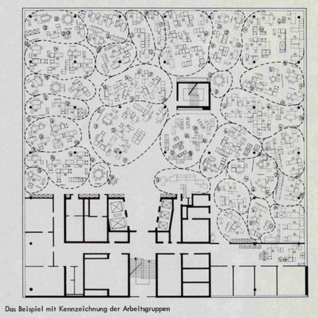
 There was a curious addition to a 2016 report on the Top 10 Technologies Driving the Digital Workplace from tech researchers Gartner. It wasn’t a technology at all but rather a slightly obscure office design concept that originated in Hamburg in the late 1950s, but which tells us a lot about how we work in the 21st Century office, according to Gartner. Its history lies with the German consulting firm Quickborner. Led by the brothers Eberhard and Wolfgang Schnelle, the firm applied the egalitarian principles of the post war world and rejection of the scientific management theories that had created the familiar factory-like rows of desks that had come to dominate open plan offices to create something more in tune with the new age.
The resultant idea of Bürolandschaft (German for office landscape) applied organic forms to create something they considered more humane and natural. Although the model used conventional office furniture, it was laid out organically and divided up by plants and screens to reflect the needs of individuals and teams and to reflect flows of communication. Management was no longer isolated to private offices. Spaces were defined by the functions of the people who worked in them and their relations to colleagues.
Some familiar themes
These are very familiar themes in what we often call the new world of work, especially with its focus on agile and activity based working. But in the post war world the focus was on overcoming the rigid hierarchies that had dominated the workplace since the turn of the 20th century.
In 1958, the same year that Quickborner popularised Bürolandschaft, the giant US office furniture manufacturer Herman Miller recruited a designer called Robert Propst to design a new range of products specifically for open plan offices.
Although he came to be known as the father of all those cubicle farms that dominated US office life in the late 20th Century, and still do to a lesser extent, he was driven by some of the same principles as the Schelle brothers. He shared the Schelle’s yearning for egalitarianism and human focussed design and once bemoaned that ‘the cubiclizing of people in modern corporations is monolithic insanity’.
His 1968 treatise called A Facility Based on Change set out the core principles of Action Office and his focus on people and their interactions is clear. Even so, the allure of command and control management structures and their desire for linearity meant his vision and that of the developers of Bürolandschaft was overwhelmed by the mainstream.
The result was the now familiar well-ordered open plan that may have manifested itself in its own way in different part of the world, but was evidently linked to management hierarchies.
A new world order
Until recently that is. The fact that the world’s leading tech analyst has rehabilitated the idea to define the new relationship between the physical and digital workspace tells us that this is an idea so closely aligned to the needs of people – the workplace’s only almost-consistent element – that its core principles of people-centricity and organic design may be eternal.
Of course, the context in which it matters have changed. We live in an era of technology that the Quickborner team could never have imagined. Yet the things that drive people and the way they think, behave and interact with each other are more or less constant.
As the office starts to function more like an app with a menu of options for its user, so too does the technology absorb some of the characteristics of the physical environment
At its inception, the idea of Bürolandschaft was defined by pioneers in a world reshaped by new ideas in the wake of a global cataclysm, and in a nation that was at its epicentre. It was the age of the German Wirtschaftswunder and the founding of the then European Common Market. Its history is bound up with the movement towards a more inclusive, egalitarian and collaborative world.
Its enduring resonance also now lies with its applicability to new ways of working. Not only do its principles make it an ideal touchpoint for the era of activity based working, in which people are encouraged to move through the carefully designed organic forms of an office, it also bridges the former gaps between digital and physical space.
As is so often the case with these things, as the office starts to function more like an app with a menu of options for its user, so too does the technology absorb some of the characteristics of the physical environment.
In that regard, it’s perhaps unsurprising that Gartner have chosen to align a 60 year old model of office design alongside unmistakeably 21st Century workplace trends such as algorithms, immersive technology and AI.
The first open plan backlash
Whatever you make of the current and frankly un-nuanced debate about open plan offices (one of the latest pieces of research suggests they may be better for us than private offices) we have all been here before. The organic and people centric principles of Bürolandschaft originally developed in the 1950s as a way of creating a more democratised and collaborative open workplace, quickly mutated when spliced with corporate DNA into the North American bullpens and European clusters of workstations we now see as stereotypically open plan. When people complain about the problems of open plan, it is these models of design to which they are referring.
Fifty years ago, there was widespread interest in finding ways to address the most common issues created by the new generation of open plan offices
This is nothing new. By the 1960s questions were already being raised about the wisdom of these sorts of layouts, especially in Europe. Partly this was cultural, but new co-determination laws in Germany, the Netherlands and Sweden also meant that workers’ voices were widely represented at board level for the first time, leading to a greater focus on their needs and preferences. Technological developments also meant that offices were becoming generally noisier places to work.
These forces coalesced to forge the nascent principles of workplace wellbeing we know today. Fifty years ago, there was widespread interest in finding ways to address the most common issues created by the new generation of open plan offices, especially with regards to noise, personal space, meetings, natural light and ergonomics.
Dutch courage
One of the first and most striking manifestations of this new approach came about in the Netherlands city of Apeldoorn during 1968. This was the year that financial services firm Centraal Beheer commissioned Dutch architect Herman Hertzberger to create a new headquarters for its staff but with the sort of brief that will sound very familiar to modern ears.
‘It should be a place where 1,000 people can feel at home. The employees must have the feeling of being part of a community without being lost in the crowd.’
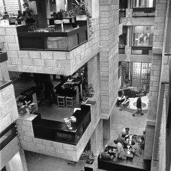
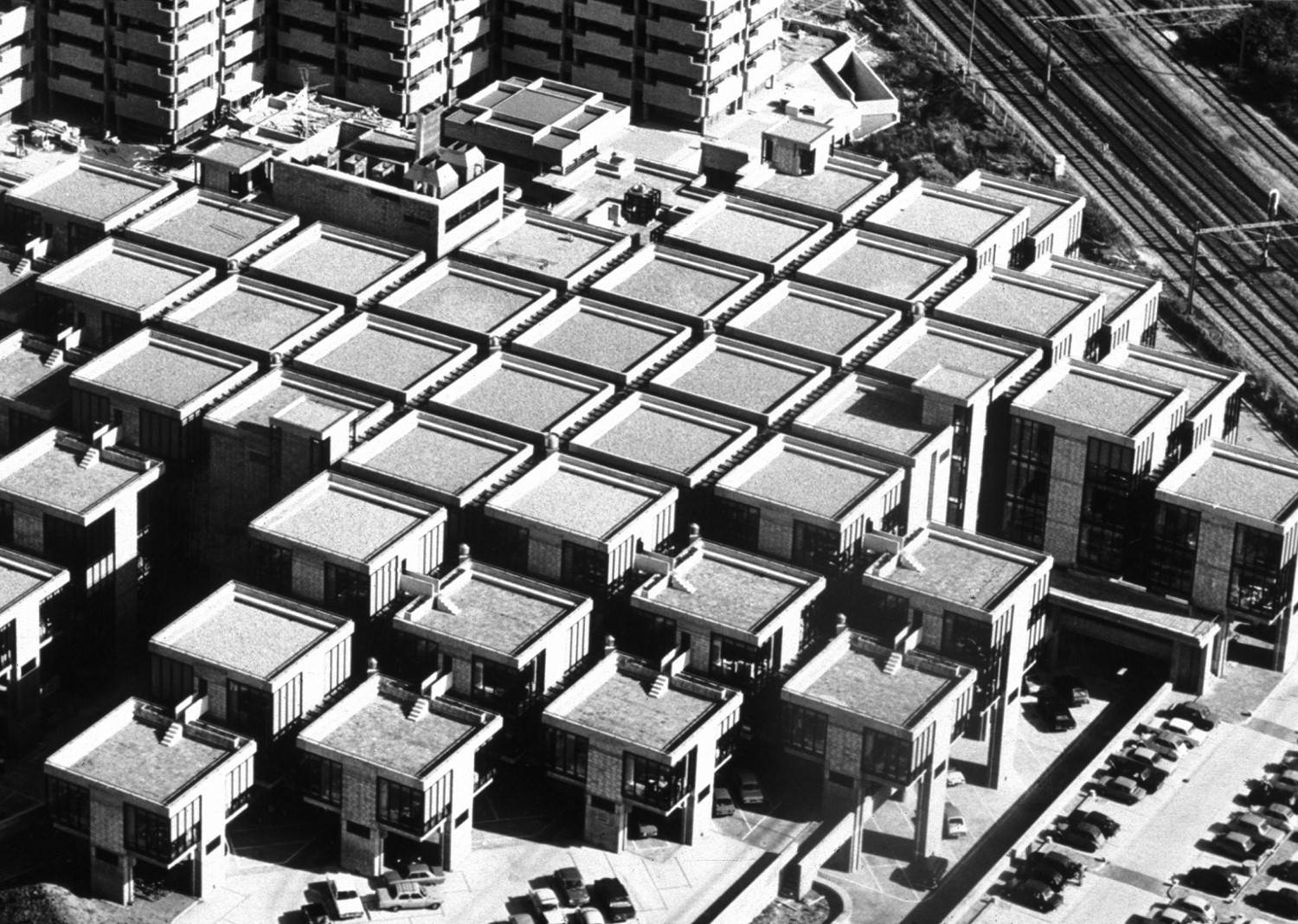 The solution developed by Hertzberger and his colleagues was unique. They fragmented the building into modular blocks consisting of 9 metre cubes. The 56 cubes of the building were linked by public atria, communal space and walkways and perhaps the first iteration of an office ‘street’ to create a whole. Illumination came in the form of natural light and lampposts, emphasising the feeling of a tight-knit medieval town.
Each cube was designed to accommodate up to ten people who were invited to customise their surroundings with personal accessories, plants and elements from their homes. The fractal spaces created by this configuration became more intimate for teams of people – most research suggests that teams should be under ten people to optimise decision making. The spaces also addressed the acoustic problems commonly associated with traditional open plan space.
The result is something conceptually similar to what we now refer to as activity based working, in that people are free to move around the building, albeit that the nature of 1970s work and technology meant they spent more time at a dedicated workstation than would now be the case. The most important outcomes were the same though; a greater emphasis on individual wellbeing and empowerment along with the sense that people were part of both a small group and a larger community.
Forward to the combi office
The major drawback with the Centraal Beheer building was that it was very space hungry. Its principles were ahead of their time, but it wasn’t a practical solution for everybody.
Another solution and ultimately more popular to the challenges posed by open plan offices appeared for the first time at the offices of Canon in the Stockholm suburb of Sätra in 1978. Faced with a similar brief to that of Centraal Beheer, the Swedish architectural practice Tengbom Architects developed the idea of the combi-office.
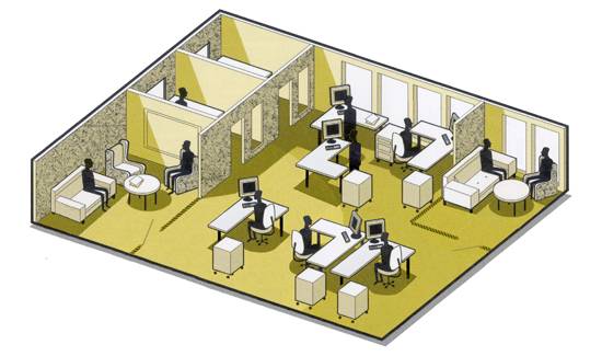 This was a much more straightforward solution than Hertzberger’s cubes. It consisted of a floor layout in which people were returned to their private cellular offices around the periphery of a floor and the central space was given over to communal and meeting spaces. This not only gave people the opportunity to work in private but also enjoy more natural light from the windows in their dedicated rooms.
In the US, the idea was picked up and popularised as caves-and-commons. It is described in Stewart Brand’s book How Buildings Learn in the following way:
‘Each office worker has a private office, often small, which opens into a generous open area surrounded by many other private offices. The open area has a kitchen, some couches, sometimes tables for sitting around informally, and sometimes a working library, or at least a rack of current periodicals. You can shut the door of your cave and concentrate, or you can leave your door open and keep an eye and ear on who’s coming and going in the commons, and whether the meeting or presentation going on there might be worth leaning in on.’
The parallels with activity based and agile working are again clear, although in a modern context it would be far more usual to see people working in communal space and retiring to private rooms only when necessary rather than the other way around. It’s an enduring model of office design that exists in updated variants to this day.
What such examples show is that our core workplace challenges are very similar to those faced by previous generations of occupiers and designers. And while the solutions are not precisely the same, their key principles can be very familiar indeed.
This feature was first published in two parts on the website of Area
[ad_2]
Source link

